

Yale Peabody Museum Interactive Experience Design
🔎 Industry
Interactive Experience, Kiosk, Museum
📊 Tools
Figma, UserInterviews.com, Unreal Engine,
I led the UX design of nine interactive kiosks for the Yale Peabody Museum. This case study focuses on how I shaped content, improved accessibility, and collaborated with developers to bring the Mineralogy and Daily Use kiosk to life.
#Project Outline
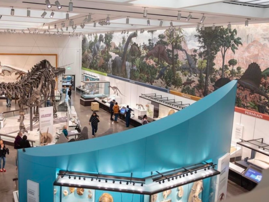
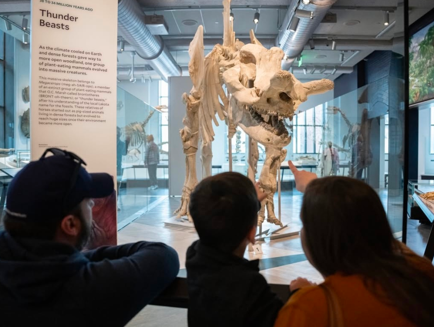
BackgroundThe Yale Peabody Museum (YPM), part of Yale University, launched a full-scale renovation in 2020 to enhance its research and collections programs. As part of this transformation, YPM identified 15 key areas for interactive kiosks designed to enrich the visitor experience by presenting Yale’s natural science research through digital multimedia, extending storytelling beyond traditional artifacts.

ChallengesDesigning these interactive kiosks was a complex challenge, with several key factors shaping the design and development process. Balancing these elements required strategic planning, iterative problem-solving, and close collaboration.

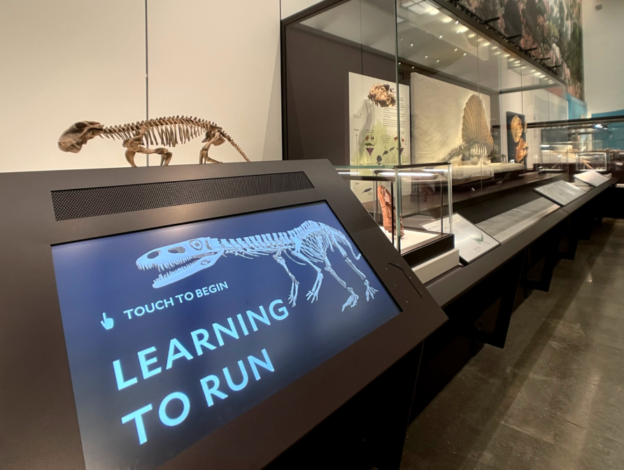
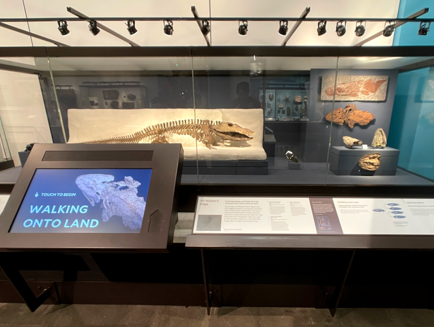
Final Design Sneak Peak
Impact
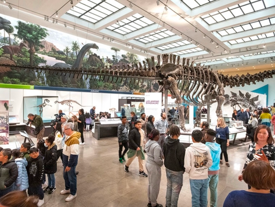
YPM’s transformation into a world-class museum resulted in a 120% increase in visitor volume, with 285,000 visitors in the first six months post-reopening. The interactive kiosks played a vital role in enhancing engagement, delivering dynamic storytelling, and making the museum’s content more accessible to a diverse audience.
My RoleAs the UX designer, I led the design of eight interactive kiosks, each presenting unique challenges. Among them, Mineralogy and Daily Use was one of the most representative, reflecting the three key phases that shaped our final outcomes and accounting for one-fifth of the project’s time and effort. This case study explores its design process, challenges, and solutions.

Design ProcessThe design process went through three key iterations, each addressing a distinct set of challenges to refine the kiosk from concept to implementation.

#Iteration 1:
From 0 to 1 – Establishing the Foundation
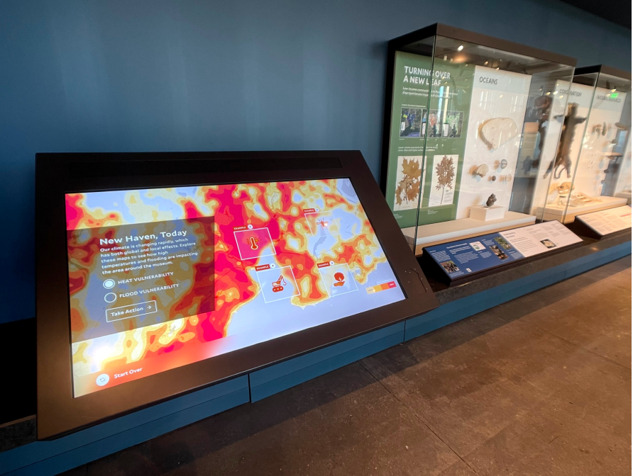
OverallTo shape the content strategy for the kiosk in the Mineralogy Hall—a historic space housing over 110,000 mineral-related specimens—we collaborated closely with Yale scholars and museum stakeholders. Our goal was to ensure the kiosk communicated complex scientific ideas in a way that was purposeful, cohesive with nearby exhibits, and accessible to a broad audience. This led to three core content considerations.
🎯 Purposeful Content
The kiosk aimed to showcase the role of minerals in daily life, natural occurrences, and sustainability efforts in conservation and recycling.🧩 Contextual Content
The content needed to align with the surrounding exhibits' themes to ensure a cohesive learning experience.🧠 Comprehensible Content
The content needed to be detailed enough to provide a meaningful scientific learning experience without overwhelming visitors.
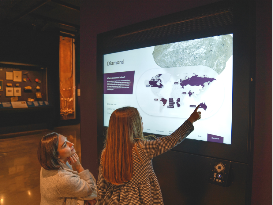
Ideation“How to create a solid foundation for the kiosk interaction while realizing all project ” goals was the most significant challenge in Iteration 1. Through co-design workshops and storyboarding, we refined the kiosk’s content structure, establishing a framework of six key minerals, each categorized into four themes to enhance clarity.

Rapid PrototypingBased on our insights and content structure, we developed kiosk prototypes to test different approaches. Through rapid prototyping, we explored various ways to present information, refining the storytelling and visual direction. With continuous iterations and improvements, we reached a key milestone in the design process.

User Test FeedbackTo evaluate the initial design, we conducted user testing with volunteers and students in collaboration with the museum. Additionally, we held stakeholder review sessions to assess the design and gather feedback.
65% of users fully explored at least one mineral from start to finish.
17% of users completed all detailed sections for all six minerals.
45% found the information scattered and difficult to retain.
70% were satisfied with the overall experience.
Findings & InsightsQualitative interviews revealed that while most participants described the experience as "clear" and "informative," few found it "engaging" or "intuitive." Many struggled to retain information from previous pages, finding the content informative but not memorable. Since all participants had at least an undergraduate education, we inferred that the kiosk might be overwhelming for younger or less-educated audiences.

Stakeholder Review & RequestsBeyond user feedback, stakeholders emphasized the importance of visual consistency, ensuring the Mineralogy Kiosk aligned with other museum kiosks. They also highlighted accessibility concerns, emphasizing the need for an inclusive experience for all age groups.
#Iteration 2:
Design Solution Refinement
Problems DefinitionUser testing and stakeholder feedback from Iteration 1 revealed key areas for improvement. While the initial design established a strong foundation, findings indicated that the content was too dense, accessibility gaps remained, and visual inconsistencies emerged. To address these issues, Iteration 2 focused on three key challenges:

📃 Challenge 1: Content Simplification
DilemmaWhile the Iteration 1 design made the content feel heavy to absorb, YPM stakeholders resisted further simplification, fearing it would weaken its educational impact. This posed a key challenge: “How can we optimize content for better engagement while ensuring stakeholder buy-in?” This question became the focus of Iteration 2.
Solution 1: User Behavior ResearchTo persuade stakeholders to approve content simplification, we conducted a user behavior analysis, examining museum visit duration, engagement patterns across exhibit zones, and kiosk attention spans to support data-driven decisions.
⏱ Time Per Kiosk: Ideally, visitors would spend 2–3 minutes at each kiosk, but in practice, their time was often shorter.
📉 Attention Decline: Focus tended to decrease on higher floors, with the Mineralogy exhibit located on the highest level.
🖐️ Interaction Preference: Visitors favored exploration over deep reading, often moving through content quickly.
Solution 2: User Cognition LevelsTo structure content effectively, we introduced a knowledge hierarchy framework, classifying users on a 0 to 6 scale based on their familiarity with mineralogy. We then conducted user questionnaires to evaluate visitor cognition levels and tailor the content accordingly. Findings showed that most respondents fell within Level 3, indicating a basic to intermediate understanding of mineralogy.

Solution 3: Content TargetingThe first two solutions effectively helped stakeholders understand the need for content simplification and approve the strategy. With their support, we refined the content by categorizing it based on difficulty and thematic relevance to better align with the kiosk’s focus.
We structured the content into three difficulty levels and three relevance layers, selecting targeted areas to ensure a balanced, engaging, and digestible experience for diverse visitor demographics.

These research-based solutions enabled us to develop a more engaging yet digestible content strategy compared to the initial version, helping us build the updated information structure.

🛠️ Challenge 2: Accessibility Refinment
OverallUser testing from Iteration 1 and stakeholder feedback revealed key accessibility issues that needed to be addressed. Since this project was designed for a museum—an inclusive public space serving a diverse audience—accessibility requirements were particularly high, requiring a comprehensive and far-reaching approach.
Bottleneck 1: Screen Size BarrierThe kiosk was designed for a 55-inch screen, but due to its installation location, some interactive elements in the initial design were inaccessible to shorter visitors, including children and wheelchair users.
To ensure comfortable access for all visitors, we redesigned the UI placement based on accessibility guidelines (Universal Design Plan for Exhibit Design & Development, Museum of Science). We then tested reachability through simulated user heights and real-world testing with museum staff.

Bottleneck 2: Visual Accessibility & WCAG ComplianceThe initial design lacked a cohesive visual system and did not fully meet WCAG 2.1 AA accessibility standards. Insufficient color contrast made text difficult to read for visually impaired users, while inconsistent typography affected readability and accessibility.
To enhance readability and compliance with WCAG 2.1 AA standards, we collaborated with the museum’s visual design team to align theme colors with accessibility needs while preserving brand consistency. We also standardized typography, ensuring appropriate font sizes and weights, and refined the overall design system.

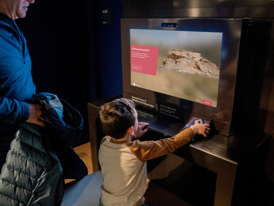
Bottleneck 3: Limited Accessible NavigationThe initial design lacked alternative navigation methods, making it inaccessible for users with low vision and other disabilities. Additionally, one of the kiosks featured a non-touch 3D display, requiring a dedicated accessible input solution to ensure usability for all visitors.
To address this, we integrated a keypad for input and added audio output to enhance accessibility. We also designed an onboarding screen to guide users on keypad functionality, ensuring an inclusive experience across both standard touch kiosks and the non-touch 3D screen kiosk.

📐 Challenge 3: Design Usability
OverallUser feedback revealed that, beyond content and accessibility concerns, the initial design had usability issues that affected the overall user experience. To address these, I refined key interaction and visual elements to improve clarity and engagement.
Update 1: Improved Mineral DisplaysTo help users instantly recognize the showcased mineral on each page, I enlarged the display areas of featured minerals, making them more visually prominent. This not only enables quick identification but also allows users to closely observe finer details.

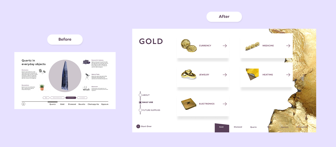
Update 2: Redesigned Mineral Distribution MapUsers found the text-heavy design of the mineral distribution map overwhelming, leading to cognitive overload. To improve readability and reduce visual strain, I redesigned the page with a collapsible layout, interactive animations, and enhanced visual storytelling, guiding user attention to key elements without excessive text.

Update 3: Revamped "Minerals in Daily Life" SectionSimilar to the map page, presenting all information at once led to cognitive overload. To encourage exploration and reduce reading fatigue, I introduced an interactive card-flip effect, prompting users to actively engage with the content and discover details at their own pace—ultimately enhancing engagement and information retention.
Output & ReviewThis iteration received positive feedback from both users and stakeholders, effectively addressing content overload, usability, and accessibility challenges while maintaining educational depth and improving engagement.
100% of users fully explored at least one mineral from start to finish – a significant boost in engagement.
56% of users completed all detailed sections for all six minerals – indicating a greater willingness to explore content in depth.
15% of users found the information scattered and difficult to retain – demonstrating notable progress in content simplification.
85% of users were satisfied with the overall experience – validating usability enhancements.
Average time to explore one mineral section: 40 seconds – suggesting a lighter, more approachable experience, allowing users to engage with more sections within their attention span.

#Iteration 3:
Overcoming Development Constraints
DilemmaAlthough the updated Iteration 2 design received positive feedback and proved to be a functional solution, it faced unexpected challenges during development.
⏰ Time Constraints
Although the project spanned two years, much of that time was dedicated to hardware renewal, stakeholder collaboration, extensive reviews, and the approval process, leaving only eight months to develop 15 kiosks. Given the project's complexity, this tight timeline posed significant challenges in balancing quality and efficiency.
💻Technology Constraints
To speed up production, the development team built a reusable framework in Unreal Motion Graphics UI Designer (UMG) with modular plugins that could be applied across multiple kiosks. While this approach increased productivity, it also restricted design flexibility—custom layouts, unique visuals, and complex interactions became more challenging to implement. The Mineralogy Kiosk, in particular, deviated significantly from the standard framework, requiring additional development time.
🔄 Workflow Challenges
Several kiosks had already gone through multiple rounds of stakeholder approvals, making late-stage design revisions difficult and time-consuming. Meanwhile, introducing a unique design pattern for the Mineralogy Kiosk risked breaking consistency across kiosks, complicating both development and user experience.
Problem DefinitionTo navigate these constraints, we examined the design elements that introduced development complexity. Weighed against their potential to enhance user experience and the constraints of a tight timeline, we made a strategic decision: rather than pursuing a fully custom design that could delay production, we aligned with existing patterns to maintain efficiency while preserving the core experience.

PreparationAs a cross-functional problem-solving stage, preparation required teamwide collaboration. This process helped designers better understand development constraints, work more effectively with developers, and make informed design decisions, prioritizing impactful changes while minimizing complexity.

Bottleneck 1: LayoutThe initial design lacked a consistent left-right image-text structure, with varied layouts that didn’t align with the standardized development template.
To resolve this, I restructured the content into a standardized left-aligned text with a right-side image/interactive zone. To further enhance visual consistency, I incorporated the angled block shape, a recurring design element in other kiosks, as a unifying background for text content.

Bottleneck 2: AnimationThe initial design included transitional animations not present in other kiosks, altering layouts, and complicating implementation.
To resolve this, I removed complex animations such as map window morphing, card flips, and curve transformations, replacing them with instant transitions and swipe-in/out effects for a more intuitive and development-friendly solution.

Bottleneck 3: ComponentsThe initial design included exclusive custom components that disrupted consistency across kiosks.
To address this, I replaced unique elements with existing, reusable components. For example, on the Future Supplies page, I swapped the curve-based narrative line with the horizontal radio menu from the Dispersal Kiosk, ensuring a clear, linear information flow while improving efficiency.

Output & Review:With these refinements, we overcame development challenges. Stakeholders well received the solution, and developers endorsed the updated approach. I collaborated with the team to refine the developer-designer workflow, applying these improvements across all future kiosk implementations.
⏳ Completed 25% faster than the original estimate:
The Mineralogy Kiosk was delivered ahead of schedule, optimizing development efficiency.🚀 Increased efficiency by 50%:
By applying the updated workflow to subsequent kiosk implementations, we cut development time in half, streamlining future rollouts.
#Project Key Takeaways
ConclusionIn the first six months after reopening, Yale Peabody Museum welcomed 285,000 visitors, more than doubling its previous annual attendance, while also achieving LEED Gold certification.
These interactive kiosks became a key part of the museum’s renovation, enhancing accessibility and sustainability. They provide a more inclusive, seamless user experience, allowing visitors to explore exhibits in greater depth.

What I LearnedThis project reinforced my belief that design is a process of exploration, negotiation, and refinement—where every decision not only shapes the final outcome but also serves as an adaptive, evolving problem-solving strategy that responds to different challenges.
🎯 Communication Shapes Outcomes: A designer’s role isn’t just about the end result—it’s about creating alignment. Facilitating conversations between stakeholders, developers, and team members was just as crucial as crafting the final experience.
🧩 Design is Strategy, Not Just Execution: Design methodologies and design thinking aren’t just for deliverables—they also support project strategy and decision-making.
💡 Bridging UX & Development: Understanding technical constraints is critical for designers. Seamless communication with developers helps improve feasibility while maintaining design quality.
Broader ImpactBeyond the core design work, I also contributed to shaping the museum’s long-term digital experience strategy through content management, experimental adaptations, and knowledge sharing.
🛠Content Management: Designed a museum-specific Content Management System (CMS) for seamless updates and created an owner’s manual to support museum staff.
🔄Interactive adaptations: Experimented with alternative formats for kiosk interactions, including transforming Locomotion into a 3D animation and Virtual Archaeology into a VR game, testing engagement across mediums.
📖 Knowledge Sharing: Documented insights and shared learnings through articles and case studies to contribute to the design community.