
Onboarding and Homepage Redesign for an automated impact investing app
I redesigned Flit Invest’s onboarding and homepage to increase engagement and conversions. The improved onboarding process reduced drop-off rates, while a refined homepage layout and strategic CTA placement made key actions clearer and more intuitive.
🔎 Industry
Fintech
🗓️ Duration
15 weeks
📊 Tools
Figma, Maze, Dovetail, Attention Insight,
#Project Outline
BackgroundFLIT Invest is an automated investing app that empowers users to grow wealth while aligning their investments with personal values, such as climate solutions, equality, and affordable healthcare. Users can pursue financial goals while contributing to a better, more sustainable world.

ChallengesA beta test with 50 users revealed that the app's initial version fell below expectations, indicated significant user friction & pointed to low user engagement.
46% drop-off rate during the onboarding process.
578 Seconds average duration to finish the onboarding process.
12% CTR to the investing features from the homepage.
In response, FLIT Invest launched an improvement strategy that included rebranding its visual identity, expanding social media outreach, enhancing content marketing, and launching a significant app redesign.

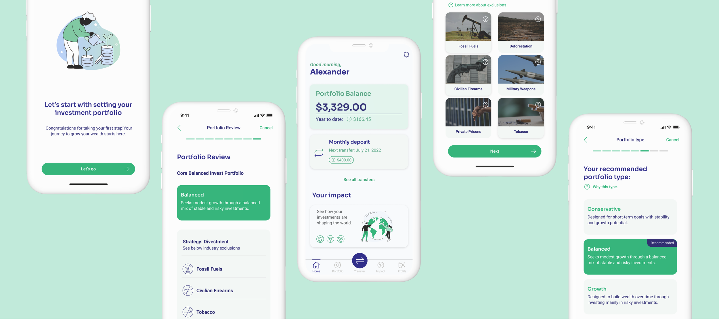
Final Design Sneak Peak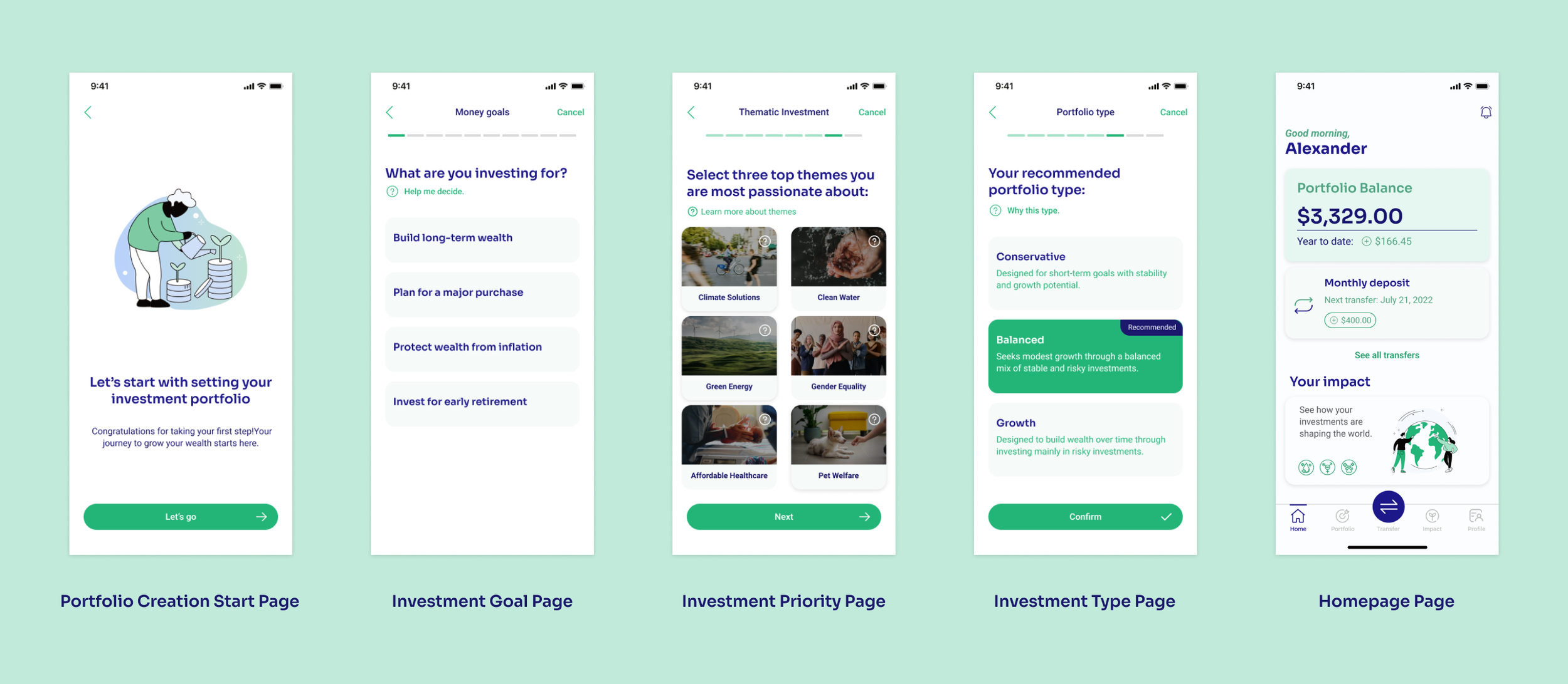

Impact
The drop-off rate during the onboarding process decreases by 21%
The average duration to finish the onboarding process decreased by 162 seconds
The CTR from the homepage to the investing features increased by 18%
My RoleI collaborated with UX researchers, developers, and a senior designer to refine the portfolio creation process of onboarding and homepage experiences, improving usability, engagement, and user satisfaction while achieving measurable improvements.

#Design Task 1: Portfolio Creation Onboarding Redesign
Design ApproachThe redesign process followed a clear and structured approach. I collaborated with the UX researcher to analyze beta test results and identify key findings. We refined these insights through internal testing and validated them with user interviews to define the core problems. From there, I partnered with the senior designer to redesign the onboarding process, moving from ideation to high-fidelity prototypes. We prioritized issues, brainstormed solutions, and tested the redesign to measure its impact—gathering feedback to guide future improvements.

🔎 Problem Finding
Tests Results AnalysisI worked closely with the UX researcher to analyze data from each step of the portfolio creation process. Our focus was identifying improvement areas by examining drop-off points and measuring the average time spent on each page.

Internal ReviewWe explored key questions and early assumptions, such as what causes delays in completing specific steps and whether unclear content leads to confusion. Reviewing the user flow from a first-time user’s perspective helped uncover potential pain points and design flaws. (function: transitional pages, info collecting pages, info confirming pages)
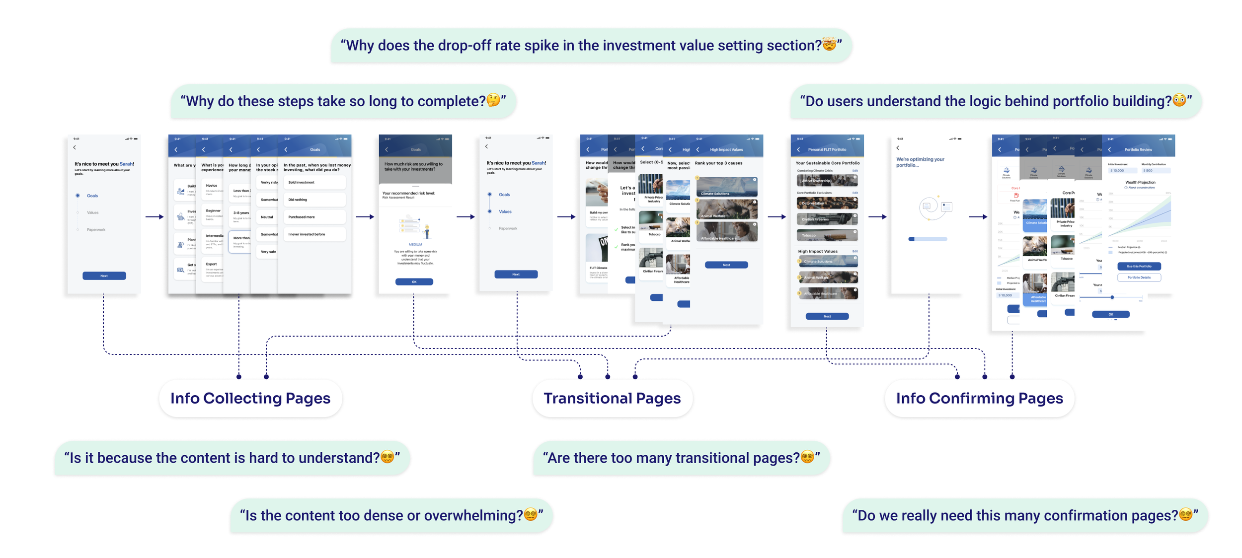
User InterviewAfter completing the internal evaluation, we conducted user interviews with existing users to gather insights on their portfolio-creation experience. We captured key points from their feedback, organized and categorized them. This process not only validated our earlier findings but also revealed new insights.

"It felt way too long. I started feeling impatient halfway through and even considered quitting before finishing."
“It just moved me to the next step without anything that felt like closure."
"I felt stuck and unsure whether I had two steps left or ten steps to go."
“Some of the terms were hard to follow. I didn’t feel confident because I wasn’t sure I understood what I was choosing.”
Problems DefinitionBuilding on the insights gained from research and analysis, we identified four key problem areas to address in the redesign process. These pain points served as a foundation for defining clear design goals and guiding the next steps in our work.

💡 Design Solution
Streamlining User FlowLonger processes often cause users to lose patience and give up onboarding. To address this, we used a branching logic test to refine the flow—keeping, combining, or removing steps—and made optional steps skippable based on users' investing experience.
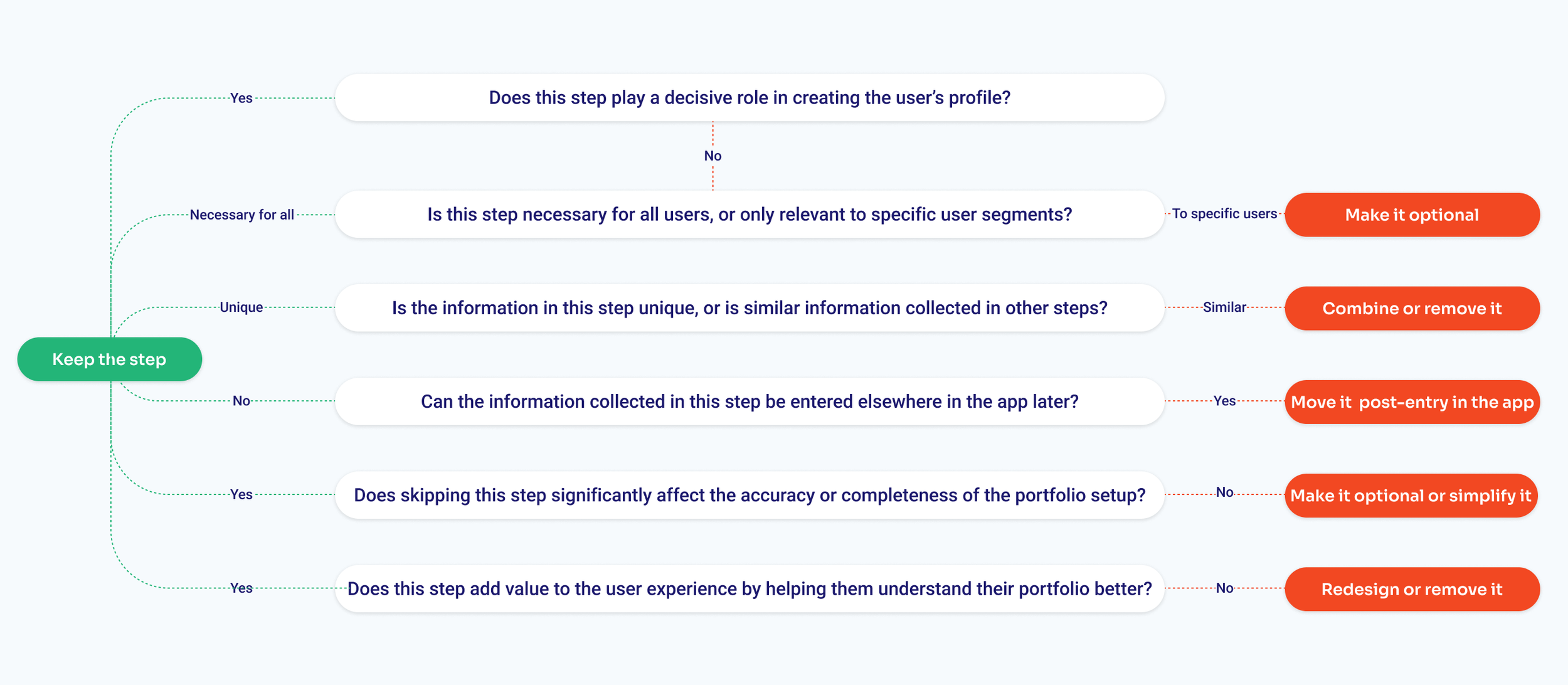
After reconsolidating and categorizing the steps, we restructured the user flow by merging 'Goal Setting' and 'Value Setting' into one step and reducing portfolio review pages. These changes minimized unnecessary transitions, making the portfolio creation process faster and smoother.

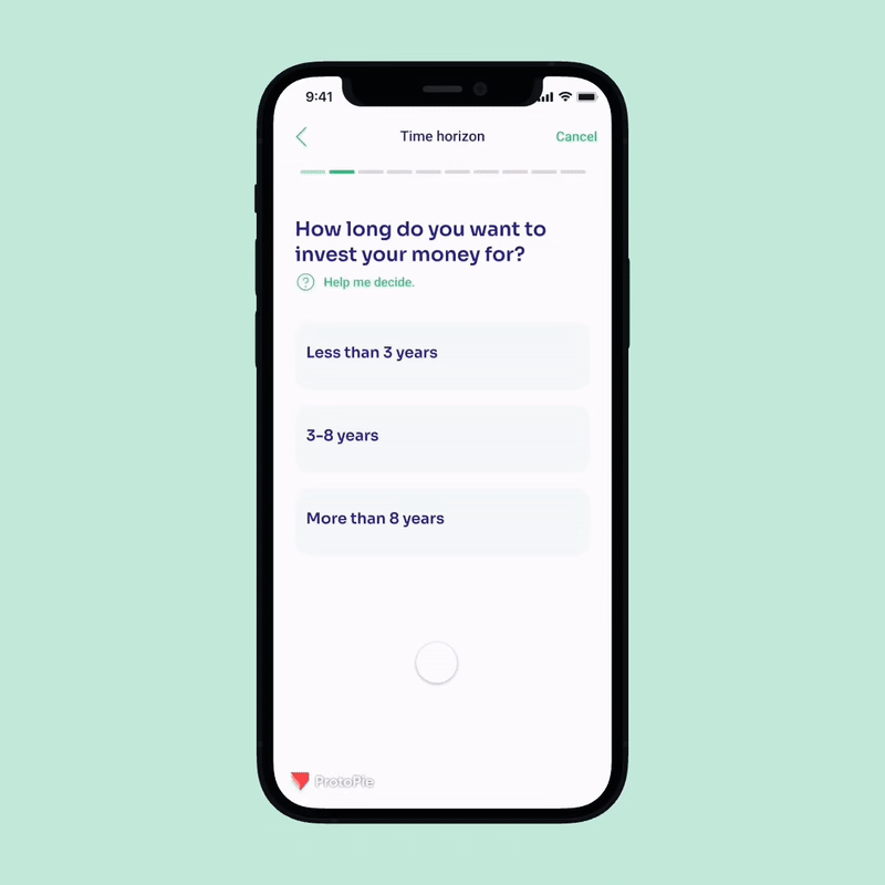
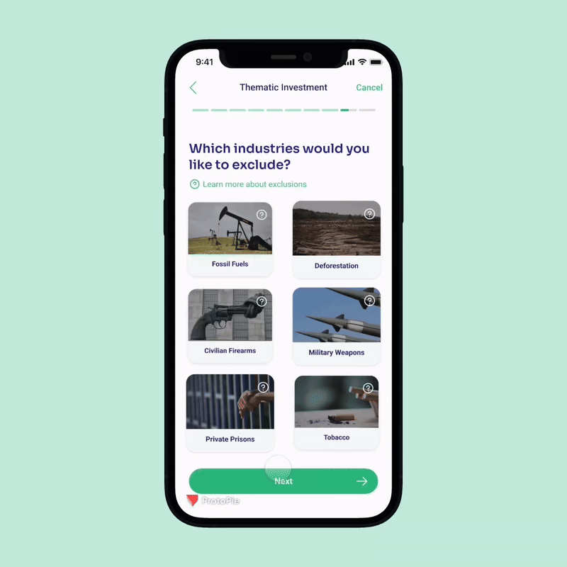
Improving Progress BarThe initial UI design lacked clear indications of progress, leading users to confusion and frustration. After multiple design iterations, we updated the progress bar to the design with quantifiable dash steppers. This improvement offered a transparent visual representation of the completed and remaining steps.

Standardized TerminologyWe standardized the terminology throughout onboarding to reduce cognitive load and help users grasp new concepts more easily. By using consistent terms, such as "portfolio," we familiarized users with key ideas early on, making the experience more intuitive and user-friendly.

Refined and Concise ContentWe streamlined the content by removing unnecessary text, especially in the early steps that involve simpler concepts. Clear and concise language was used to articulate ideas without overloading users with excessive details. This approach conserved users' energy, allowing them to stay focused and engaged throughout the later, more complex steps.

Tooltips and AssistanceFor steps containing more detailed information, we introduced tooltips and help icons to provide users with contextual guidance. These elements ensured that users could access the assistance they needed anytime, making complex steps more manageable and reducing potential frustration.
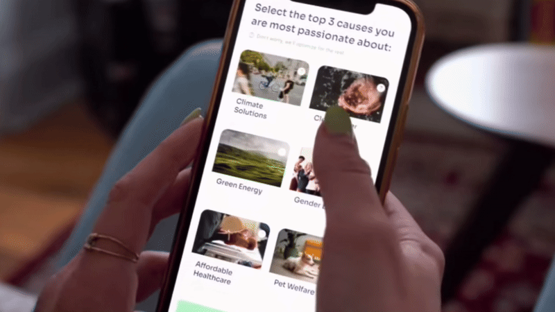
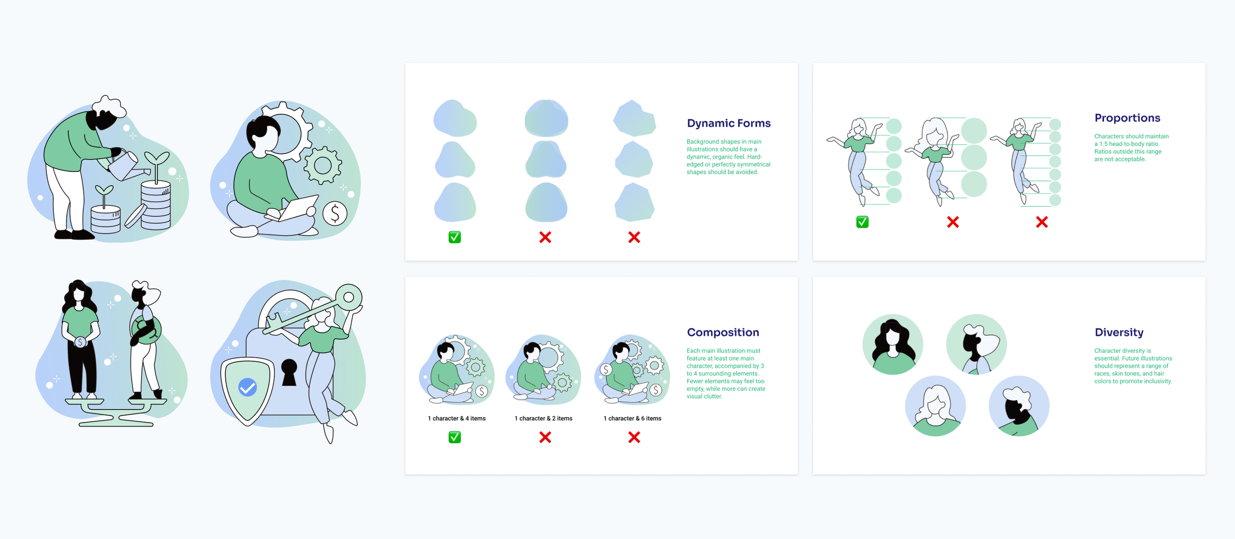
Enhancing Emotional EngagementWe added custom illustrations aligned with FLIT Invest’s visual rebranding and design language at the beginning and end of each onboarding section to create a welcoming and engaging experience. Positive reinforcement, such as success messages at the completion of each section, was incorporated to celebrate progress and encourage users, fostering a sense of accomplishment and emotional connection. (86% preffered illustrations)
📋 Task Review
Direct ContributionsReduced Portfolio Creation Onboarding time to 145s.
Drop-off rates in the Portfolio Creation Process decreased from 21% to 10.5%.
Surveys showed a 30% increase in user satisfaction, with users praising the process as “clearer,” “more intuitive,” and “engaging.”
Potential OpportunitiesFor the next step, we will refine the transition from onboarding to in-app functions, helping users confidently make their first investment with customized guidance.
#Design Task 2: Homepage Redesign
Design ApproachUnlike Task 1, Task 2 had a shorter timeline. I analyzed the beta test results from the UX researcher, validated key findings, and refined the design through iterations. We tested the updated design, gathered insights, and evaluated its impact, identifying areas for further improvement.

🔎 Problem Finding
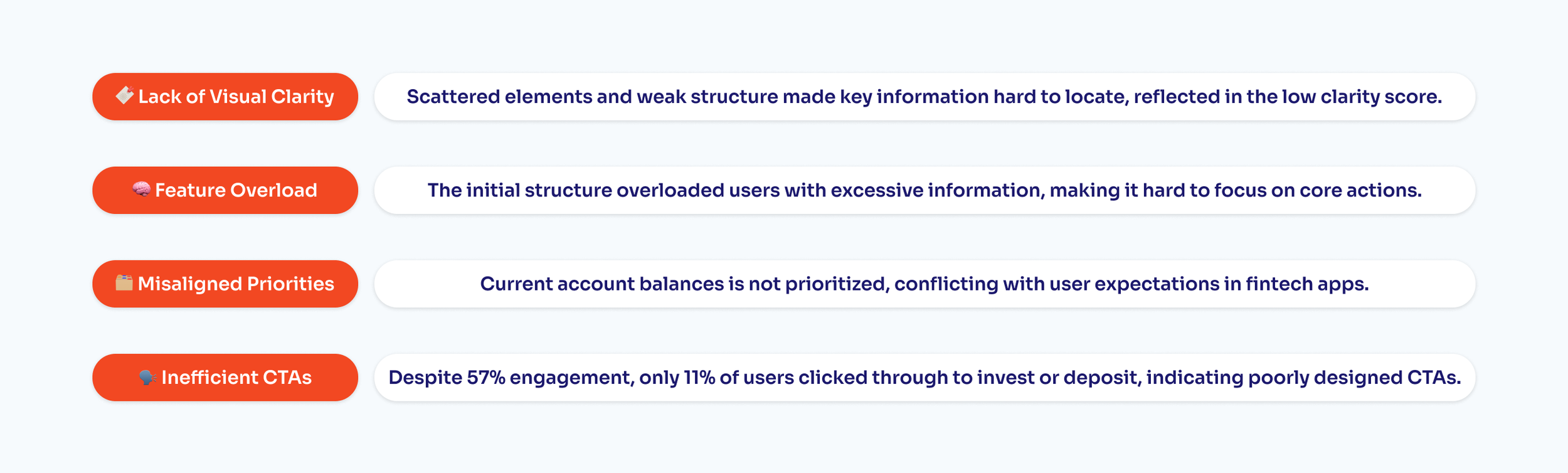
Tests Results AnalysisThe test results reflect several usability issues of the initial homepage design, the busy page structure, and poorly placed call-to-action elements. While users explored the page, they struggled to quickly grasp key information, preventing them from taking the next step toward investing or depositing.
Heatmap AnalysisWe used heatmaps to analyze cognitive load and user attention distribution, uncovering both underutilized and overcrowded areas.

User FeedbackBeta testing revealed that many users struggled to understand the homepage’s primary function. They felt overwhelmed and had trouble finding key information. Unclear call-to-actions led to confusion and hesitation.
To gain deeper insights into user expectations and frustrations, we conducted a small-scale but in-depth interview.

Problem DefinitionBased on beta testing results and heatmap analysis, we identified key issues that needed to be solved on the homepage.
💡 Design Solution
Competitive ResearchTo tackle the homepage’s usability issues, we conducted in-depth competitive research to identify best practices for clarity, engagement, and CTA effectiveness.
We analyzed popular Fintech Apps that are widely used, like Chase, Marcus, Mint, Wealthfront, Betterment to identify industry-standard user behaviors, CTA placements, and homepage structures and learn how they balance education and functionality without overwhelming users.

Function ReconfigurationTo reduce distractions and cognitive load we rearranged the functional sectionals within the homepage. We removed features like “Your Goals” and "Articles". And redesigned the homepage into a single scrolling layout, ensuring key information remains visible and preventing important content from being cut off below the fold on smaller devices.
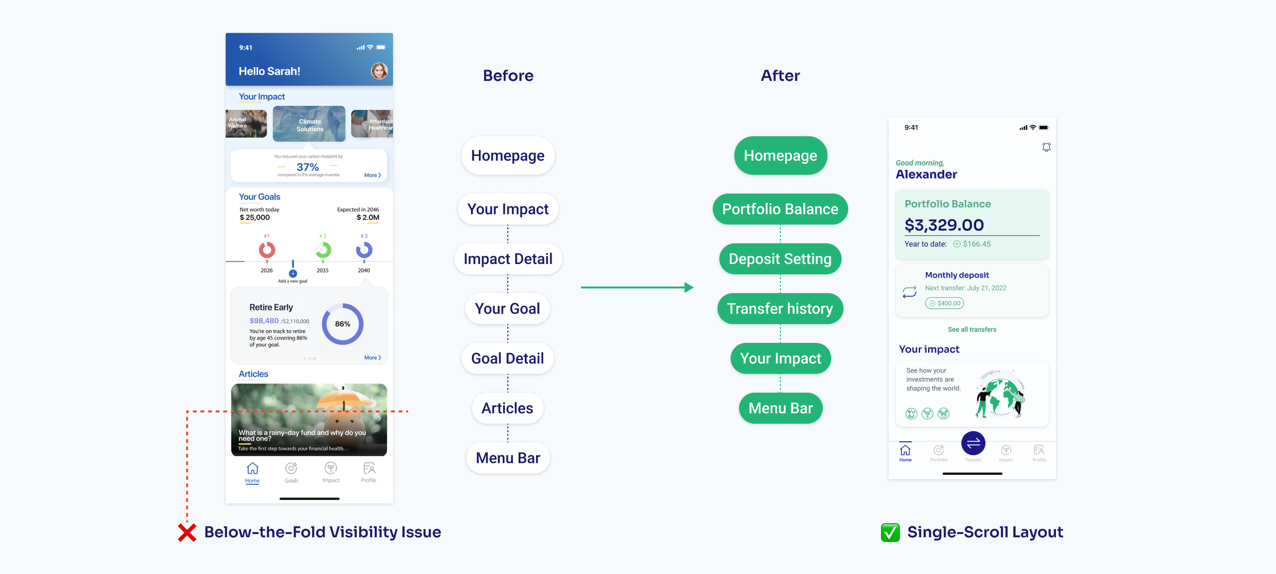
Balance TransparencyWe prioritized the user’s current account balance as the most prominent element on the homepage, aligning with standard FinTech user expectations. This change lets users quickly assess their financial status before making investment decisions, enhancing clarity and building trust.

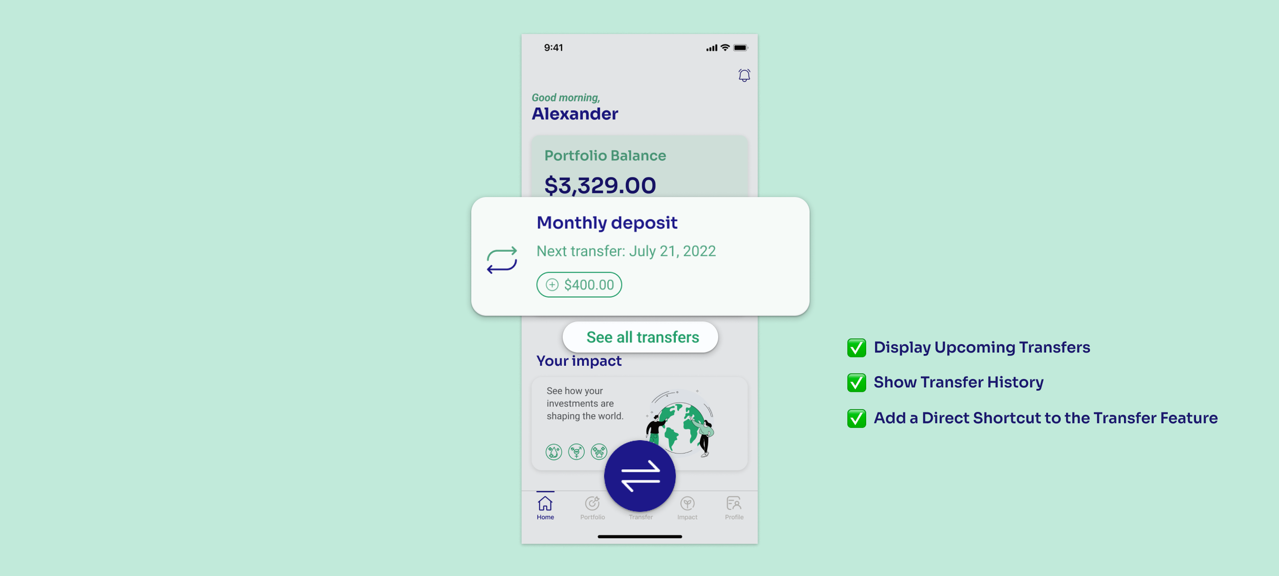
Call-to-Actions RefinementWe adjusted call-to-actions by reducing options with clearer visual elements like buttons and icons to guide users toward key actions. We also integrated the “Transfer” function directly into the homepage, ensuring users can easily deposit funds and start investing without friction.
📋 Task Review
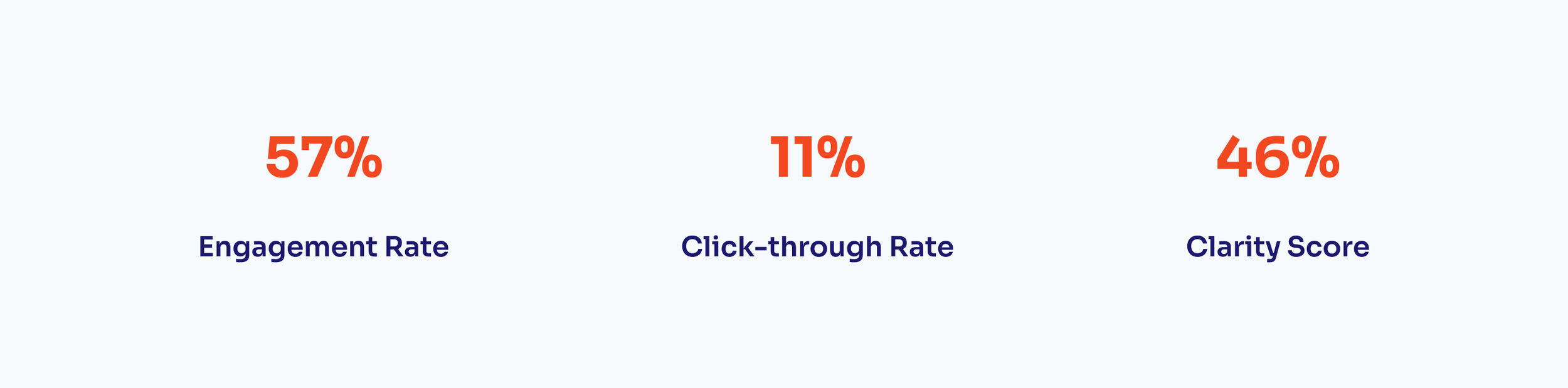
Direct ContributionsThe clarity score increased to 57%
The engagement rate increased to 72%
The CTR increased to 27%
Potential OpportunitiesNext, we will continuously test and refine CTA placements to enhance engagement and conversions while tailoring homepage messaging to guide new users toward confident investment decisions.
#Project Key Takeaways
ConclusionBoth redesign tasks significantly improved the updated version of the app. Combined with effective rebranding and marketing efforts, the product launched successfully. Users praised the updated version for being much more beginner-friendly. These redesign efforts not only improved user experience and satisfaction but also aligned the product more closely with FLIT Invest’s mission of making impact investing accessible and intuitive for all.

What I LearnedThis project reinforced my belief in the power of user-centric design to drive meaningful change, both for the product and its users.
🤝 Design is Interconnected: Redesigning a product is a systematic process that requires multi-dimensional thinking. User usability, engagement rates, and satisfaction are not isolated metrics; they are profoundly interconnected and influence one another.
🪡 Tailored Solutions for Unique Challenges: Design, research, and evaluation methods must be adaptable. Different obstacles demand distinct approaches, whether simplifying a workflow, clarifying terminology, or enhancing emotional engagement.
🗺️ The Bigger Picture Matters: A designer’s role goes beyond crafting interfaces. Understanding the product's broader scope is essential, as aligning design decisions with business goals, and considering how every element contributes to the overall user experience.